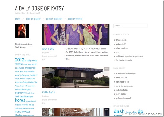
I’ve been on WordPress for around 3 months now using the Oxygen theme. Because of my ADDK x 365 thing, I was fiddling around with my template earlier this evening when I realized that my manner of posting didn’t quite fit with the theme I was using.
For one, it had a showcase page option wherein there are featured images from sticky posts at the top of your blog. This picture set is the first thing you see every time you visit my blog. Unfortunately, I’m not much of a photographer so the set still showcased the original photos I first posted back in October.
Two, the template also kind of required me to have featured images per post or else it will post my entry with a grey rectangle above it. I have nothing against grey really but to see it every time I decide to just post words without any picture whatsoever kind of annoys me a bit. It makes me feel like my words always have to have a sort of picture to back it up, like words are not enough. Anyway, this featured image thing also had a required size or else it crops the image to its liking – which doesn’t really work at all times. I’ve had a few photos cropped weirdly wherein you can just see some of the people or just parts of faces or something like that.
Three, I guess I just wanted change. This new theme of mine, Splendio by Design Disease, provided just that. Yes there are a few more colors and lines and shapes added to the view, much more than what I’ve been accustomed to, but don’t they just seem to add to the fun? ![]()
So with this post I sing so long and farewell to my old theme and the year that was.
2013, here I come!
2013 1/2


